Have you seen the new Facebook Pages layout yet? It’s definitely noticeable! Personally, we are big fans. Why do you ask? Well, Facebook seems to be moving toward a much more simplified version that takes notes from the styling of its initial debut of Pages in 2010. If you’re unfamiliar with the various phases of the Facebook evolution, you can see a cool little progression on Rant Inc.
As you can see, the first Facebook Pages were based on clean columns and were therefore very easy to navigate, which seems to be one of the main ideas behind this major 2016 overhaul. However, unlike the 2010 version of Pages, Facebook has made their newest version very image-centric (which we LOVE!) We think another possible reason Facebook chose to move in this new direction was for the mobile user experience (which is a large amount of users in this day and age). Here are some reasons why you’re going to love using the newest version of Facebook Pages for social media recruitment.
1. Navigation
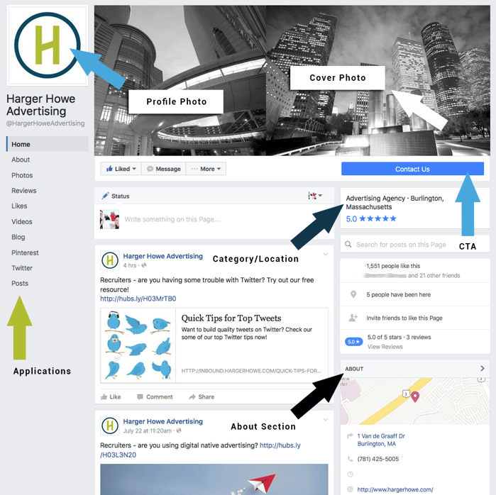
Much like the 2010 version, navigation of Pages is easy. In 2010, Facebook had tabs running across the top, but in 2016 you’ll notice that they have their own dedicated column that is decidedly above the fold. We think this seemingly small change is going to have a big impact on the candidate experience. In recent years, these navigation choices were housed under the Cover Photo, next to the Profile Photo, but in the new version, it’s incredibly clear what action candidates need to take.
*Pro-insight: Another reason why this new pages layout is so great is that is has a very obvious call-to-action (CTA) separated from the navigation of the actual page. If your goal is to have clients contact you through your microsite or careers portal, this CTA will most likely be much more effective in it’s new location.
2. Cover Image
The new cover image capability is probably the element we are most excited about. No longer will text containing categories and a username clutter up your beautifully designed cover image! No more mess! You can now make a stunning, visual statement and stop worrying about it being eclipsed.
This is particularly useful if you’d like to use your cover image as a secondary information center directing candidates to a CTA. For instance, if you’re hosting a career fair, you might consider making a tailored design directing applicants to hit your contact us CTA and BOOM, more applications!
3. Category
In the previous version of Facebook Pages, a company’s category was placed over the cover image making it somewhat difficult to read. In the new version, the category is on the right hand side right at the top. This change will make it obvious that candidates are in the correct place if they want to apply for a job in a specific industry. For instance, if you’re a retailer, it will say Retail in large print and it will also let people know what city you’re in.
Just in case you haven’t seen it, here’s a little diagram of all the need-to-know areas on the new version.

Now that you’ve familiarized yourself with the new layout, it’s time to start recruiting using Social Media Careers Pages! Would you like some examples of successful Pages? If so, make sure to download our free E-Book.


